Biofabric Visualization A tabular approach to graph drawing
Biofabrics are a relatively new and powerful approach to graph drawing and network visualization that offers an orderly, tabular representation of one's graph data. Similar to adjacency matrices, the tabular nature of biofabrics allows one to render one's graph without, for example, any node-node occlusions or edge crossings, yielding an overall more readable network visualization. Here, we aim to provide the reader with i) a small introduction to the issues commonly accosted with conventional node-link diagrammatic representations of networks, ii) a high-level overview of what biofabrics are and how they work, iii) some use cases showcasing the possible advantages of biofabrics, and, finally, iv) a basic biofabric implementation which should give the interested reader a good starting point for their own, custom, interactive implementations.

Create your own biofabric diagram application
Ready to leverage the clarity of biofabric visualizations for your own network data? yFiles provides the robust toolkit needed to build sophisticated applications that showcase this unique tabular approach.
Our advanced algorithms can handle the complex node and edge ordering required, while our rich API gives you full control over the visual representation, allowing you to highlight group structures and other key data attributes. Interactive features, animations, and flexible styling ensure a great user experience.
Build your first biofabric visualization today—for free!
The challenge
Graphs describe connectivity between entities, be these the different types of relationships between people in a social network, the transportation routes between locations in a logistics network, or the many types of interactions that exist within and between protein (complexes) in protein-protein interaction networks. The entities of such graphs are called nodes and the connections between them edges. Regardless of the particular application domain, these graphs are mostly abstract data structures, meaning they have no intrinsic visual representation. This requires network analysis and visualization experts to make use of so-called graph drawing algorithms, which take as input some graph data and produce a 1D, 2D, 3D, or higher dimensionality visualization of said graph. Most commonly, graphs are algorithmically visualized as straight-line node-link diagrams, a class of network diagram in which nodes are rendered as (labeled) points/circles/rectangles/glyphs and edges as straight line segments connecting them.
While such straight-line node-link diagrammatic representations are both well-known and easy to implement (as well as understand), they may struggle to effectively visualize complex graph data, i.e., graphs with large numbers of nodes/edges or graphs that (in addition to their topological relationships) also describe other node/edge relationships, e.g., group structures or time dependencies. A key issue here lies in the number of node-node overlaps and edge crossings that become unavoidable as graphs increase in size and complexity. Additionally, because nodes and edges are placed in 2D space, adding additional annotations, be these node, edge, or group labels, becomes difficult without obscuring the geometry of the graph drawing. Here, however, one particular and promising strategy does present itself as a possibly effective solution: The Biofabric.

What is a Biofabric?
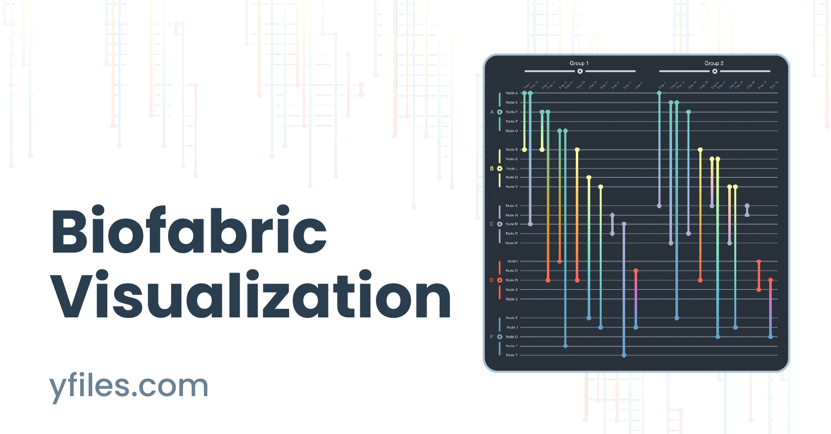
A Biofabric (originally called a Massive Sequence View) is a tabular representation of a network, in which nodes are represented as parallel, equidistant, horizontal lines and edges as parallel, equidistant, vertical lines connecting their incident nodes' horizontal lines. This means that, given some input graph G = (V, E), where V denotes the graph's set of nodes and E its set of edges, a biofabric takes on the form of a n x m table, where n = |V|, i.e., the number of nodes, and m = |E|, i.e., the number of edges. This tabular representation ensures that nodes never overlap with each other and edges never cross one-another. It additionally allows for the straightforward labeling of both nodes and edges without (negatively) influencing the geometry or visual clarity of the graph drawing.

Importantly, however, given the one-dimensional arrangement of both nodes and edges, along the y and x-axis, respectively, one can straightforwardly and effectively visualize (non-hierarchical and non-overlapping) group structures by visually grouping nodes and edges based on group membership. Note that this can be achieved without the use of an additional visual channel, e.g., color or shape, meaning these (possibly reserved) visual channels are still available to the network analysis or visualization expert. Moreover, unlike any other visual network representation, these node and edge groups can be independently collapsed/expanded, providing users with a unique and powerful Focus+Context technique with which to render only those parts of the graph they are actually interested in.
Collapsing and expanding
The layout algorithm
Similar to an adjacency matrix representation, the core challenge when visualizing a network as a biofabric is to choose a meaningful ordering of nodes (and their groups) along the y-axis as well as edges (and their groups) along the x-axis. Several possibilities have been documented in the academic literature, such as:
- Lexicographical Ordering: Arranging nodes and edges by their (alphanumerical) ID or label
- Degree Ordering: Arranging nodes by their degree, i.e., their adjacency, i.e., their number of neighbors
- Edge Length Ordering: Arranging edges by their length (given some node ordering)
- Degreecending: Arranging nodes by degree and subsequently edges by edge length to form so-called runways and staircases.
Reordering
Again, similar to an adjacency matrix, these different node ordering options allow a network analyst or visualization expert to (interactively) explore different aspects of their data easily and effectively, though, uniquely, biofabrics allow for the ordering edges as well. Certain application domains and/or data types may allow additional ordering approaches, such as ordering edges by weight or nodes by some multivariate attribute.

Use cases
As explained above, Biofabrics offer some general advantages over conventional node-link diagrammatic representations, such as i) the ability to visualize networks without any node-node overlaps or edge crossings, ii) the straightforward (re-)ordering of nodes and edges independently of each other, and iii) the ability to easily incorporate, render, and interact with node and edge groupings.
To illustrate these, as well as additional benefits, consider the use cases below (which are also featured in the corresponding interactive demo).
Company networks
A company network describes the various types of relationships between employees in a company. Some employees might be friends, others just collaborators, and others yet might be the subordinates of others. Additionally, employees are members of certain departments or working groups within the company. Thus, the graph in question can be described as a (non-hierarchical and non-overlapping) compound graph, i.e., a graph with multiple node groups) that also has multiple (non-hierarchical and non-overlapping) edge groups. Rendering such a network as a classical (force-directed) straight-line node-link diagrammatic representation would be non-trivial, and a naive implementation hereof would result in an unreadable "hairball". A Biofabric, on the other hand, by allowing for a 1D ordering of nodes and edges into groups, presents a neat and tidy view into the data, which would allow a hypothetical user to visually analyze their data much more easily.

Edge group cardinality
Individual relationships
Logistics networks
A logistics network describes the flow of goods from suppliers/facilities through people/couriers to consumers/warehouses. One common goal of logistics network visualization and analysis is to identify potential points of failure or vulnerability, i.e., nodes whose removal from the graph would disrupt transportation. Here, the network is rendered as a so-called ego-network, in which connectivity is calculated and rendered relative to some selected focal node, here the node Global Fulfillment Center. Such an ego network places nodes into so-called alter levels. An alter level of 0 denotes the focal node itself, i.e., the ego. An alter level of 1 denotes the ego's immediate neighborhood. An alter level of 2 denotes the ego's immediate neighborhood's neighborhood, and so on.

Edge labeling
Intra and inter alter connectivity
Identifying vulnerabilities
Trading networks
A (high-frequency) trading network describes the various (automated and high-speed) trades/exchanges between entities. In this fictional dataset, 50 different entities, i.e., nodes, trade 250 times with each other over the course of ten (discrete) time points. Rendering this time-dependent system as a conventional straight-line node-link diagram is hardly informative, producing another unintelligible "hairball". Conversely, the biofabric orderly arranges all time points' subgraphs next to one-another, making the visual analysis of this network much easier.

Edge group cardinality
High volume traders
Recorded webinar: An Introduction to Biofabrics
In this webinar, Henry Ehlers introduces biofabrics - a tabular approach to network visualization that handles complexity without the mess. We skip the high-level fluff and get straight into the mechanics of how it works, when it's actually better than traditional graphs, and how the underlying layout algorithm is built.

Getting started
While biofabrics feature a (comparatively) simple layout algorithm, implementing a fully-featured and interactive biofabric from scratch can be a time-consuming and complex endeavor. Thus, should you be interested in visualizing your graph data as a biofabric, you can take inspiration from our own publicly-available implementation, featured both in this demo as well as the playground below.
  graph.nodeDefaults.size = [70, 70];
  graph.nodeDefaults.style = new ShapeNodeStyle({
    shape: ShapeNodeShape.ELLIPSE,
    cssClass: "node",
  });

  graph.nodeDefaults.labels.style = new LabelStyle({
    shape: LabelShape.PILL,
    backgroundFill: "white",
    backgroundStroke: "1px solid #6A8293",
    font: "15px poppins",
    textFill: "#6A8293",
  });


  graph.edgeDefaults.labels.style = new LabelStyle({
    shape: LabelShape.PILL,
    backgroundFill: "#6A8293",
    backgroundStroke: "1px solid white",
    font: "15px poppins",
    textFill: "white",
  });
  graphComponent.fitGraphBounds()

Thank you!
Your message has been sent.
We'll get back to you as soon as possible.
About yFiles: The graph visualization SDK

yFiles is your go-to SDK for crafting advanced graph visualizations, whether you're working with Web, Java, or .NET technologies. Its unmatched flexibility and scalability enable you to convert complex data into clear, actionable visuals, fitting for both enterprise and startup needs.
With yFiles, you're equipped for the future—supporting any data source while maintaining strong data security. Getting started is seamless, thanks to over 300 source-code demos, thorough documentation, and direct access to core developer support. These resources are available even during your free trial.
Backed by 25 years of graph drawing expertise, yFiles is trusted by top companies worldwide for their most critical visualization tasks.
11 reasons why developers choose yFiles, the superior diagramming SDK


Frequently Asked Questions
Why should I use a biofabric instead of an adjacency matrix visualization?
Can I build a biofabric visualization with yFiles?
What advantages do biofabrics have over conventional node-link diagrams?
Are biofabrics intended to visualize only biological or temporal graph data?

Recap
Biofabric visualization
A biofabric is a tabular representation of network data, which render each nodes as parallel, equidistant, horizontal lines and edges as parallel, equidistant, vertical lines. The key challenge when laying out a biofabric is to choose a meaningful 1D ordering of nodes along the y-axis and edges along the x-axis. Importantly, unlike any other network visualization approach, this 1D ordering also enables the straightforward visualization of both (non-hierarchical and non-overlapping) node and edge group memberships, even without the use of an additional visual channel.
As illustrated, a biofabric representation of graph data, while at first perhaps alien, offers many additional advantages over conventional node-link diagrammatic representations of networks, such as a node occlusion and edge-crossing-free view into the data, the ability to order nodes and edge based on several criteria, or the ability to readily discern the cardinality (group size) of node and edge groups. In order to assist the interested reader kickstart their own biofabric visualizations, we have made available our own prototypical implementation as both a demo and a playground.
Related content
Choose your next steps
Get connected
Connect with our Customer Success Team regarding your ideas or projects.

Download yFiles
Try yFiles free of charge.
