Coding real-time Graphs with PuppyGraph
This guide walks you through building a real-time graph visualization of cloud infrastructure using PuppyGraph and yFiles. You'll learn how to deploy a local PuppyGraph instance, prepare and import relational data from Iceberg tables, and transform it into an interactive, filterable diagram. With yFiles' powerful layout and filtering capabilities, you'll uncover critical insights like identifying users with admin-level access to internet gateways — a key step in visualizing potential security vulnerabilities in your cloud environment.
Querying relational data as a graph with PuppyGraph
One of the most powerful use cases for graph analytics is cloud security. In this example, we'll use PuppyGraph and yFiles to build and visualize a cloud security graph. Specifically, tracing which entry points could be vulnerable to a cybersecurity attack.
For this demonstration, PuppyGraph will be running graph queries directly from data in an Iceberg table. Then, yFiles will render the query data into a graph visualization where analysts can explore service paths and user actions.
You can find everything you need in the GitHub repo , including setup instructions, sample datasets, and a deeper dive into this use case in our detailed blog post.
How to deploy and query PuppyGraph data for graph visualizations with yFiles
1. Prerequisites
2. Start a PuppyGraph instance
3. Prepare the data
4. Import data
5. Load the graph schema
6. Visualize the graph
7. Filter for admin access
8. Optimize the layout
1. Prerequisites
We'll need several things for this tutorial:
- Docker and Docker Compose
- Python 3
- yFiles for HTML
- Cloud security dataset
PuppyGraph can be deployed via Docker or an AWS AMI through AWS Marketplace. We'll be launching a PuppyGraph instance on Docker for this demo.
2. Start a PuppyGraph instance
After cloning the repository onto your local machine, you can navigate to use-case-demos/cloud-security-graph-demo and run docker compose up -d to launch the container and other services. You should see the following appear on your terminal:
  [+] Running 6/6
✔ Network puppy-iceberg         Created
✔ Container minio               Started
✔ Container mc                  Started
✔ Container iceberg-rest        Started
✔ Container spark-iceberg       Started
✔ Container puppygraph          Started
You can open your browser and go to your instance's URL to access PuppyGraph's login screen.
By default, this is localhost:8081.
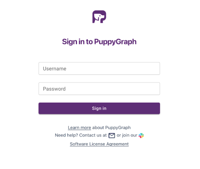

Log in using the default credentials:
  username: puppygraph
password: puppygraph123
Once we get the data loaded, we'll return to this screen to set up the schema (the blueprint for how the data is organized).
3. Prepare the data
We will first convert our csv data into Paraquet format via the python script. The Paraquet format is designed for efficient data storage and retrieval, making it perfect for graph querying.
To keep the demonstration self-contained, we recommend creating a virtual environment to activate and install the necessary packages.
  python3 -m venv demo_venv
source demo_venv/bin/activate
pip install pandas pyarrow
We can then run the following command in the repository:
python3 CsvToParquet.py ./csv_data ./parquet_data
4. Import data
Now that we have our data in the desired file format, we can begin to populate our Iceberg tables. First, start the Spark-SQL shell:
docker exec -it spark-iceberg spark-sql
You should see the following shell prompt:
spark-sql ()>
5. Load the graph schema
Going back to the PuppyGraph Web UI at http://localhost:8081 from when we set up
the Docker, select Browse…, choose schema.json from the repository and
then click Upload.
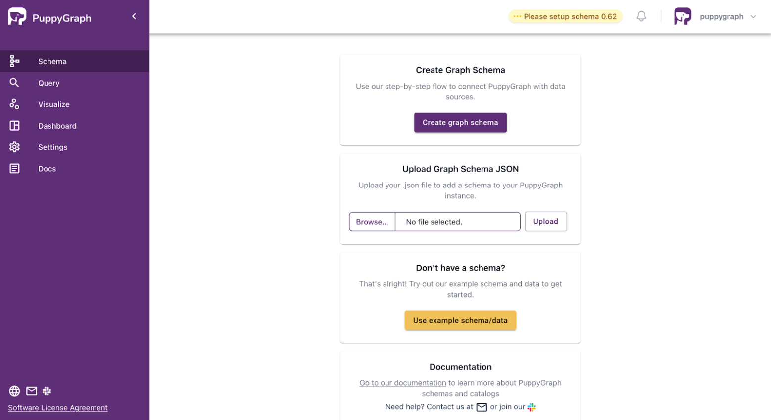
Alternatively, you can run the following command in your terminal:
  curl -XPOST -H "content-type: application/json" --data-binary
@./schema.json --user "puppygraph:puppygraph123" localhost:8081/schema
We can now query our relational data as a graph!
6. Visualize the graph
yFiles offers a
free evaluation version of yFiles for HTML
that we'll be using for the rest of this post. For websites using HTML 2.5 and higher, yWorks
has an app generator to quickly
create a web app for visualization purposes, no coding experience required. You also want the
yFiles-for-HTML server from the yFiles-for-HTML folder up and running
with npm run start so that the app generator can access the data we uploaded to our
PuppyGraph instance.
Setting up yFiles for HTML
- Download the latest version of yFiles for HTML . You may need to sign up for a free evaluation license if you don't already have one.
- Extract the downloaded archive to a folder on your local machine.
-
Open the
README.htmlorGettingStarted.htmlfile in the yFiles root directory to review the basics and requirements. -
Install the project dependencies by running
npm installin the/lib-devfolder (requires Node.js and npm). -
Start the yFiles development server with
npm run start. This makes the yFiles demo application available locally, usually athttp://localhost:3000/.
Our dataset contains quite a few kinds of vertices and edges, so we'll have to add those in. When making the visualizations, it's also possible to filter out certain information from view without needing to make an additional query. To demonstrate this, we'll only be looking at "User" and "InternetGateway" vertices, as well as the "ACCESS" edges. This will let us focus on which users have access to what internet gateways.
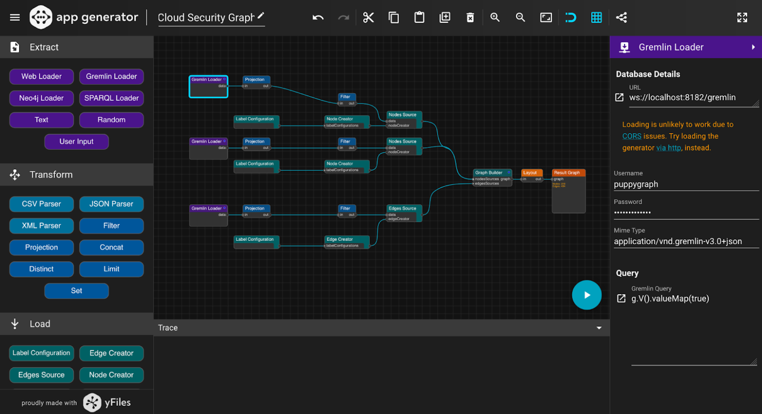
We have three Gremlin loaders to handle our nodes and edges. To simplify our graph, we only set two filters for nodes: "User" and "InternetGateway", and one filter for edges: "ACCESS". This means our graph will only focus on displaying these two kinds of nodes. We'll only need three label configuration blocks to display the ids of our nodes and edges. The app generator lets you select from five automatic layouts: hierarchical, organic, tree, circular and orthogonal. These dictate how nodes and edges are arranged in the graph. yWork's documentation also provides a helpful guide for picking the best data visualization for your use cases, making it very easy to play around and find the best fit for your needs. For now, we'll use the default Hierarchical layout. We can click on the blue play button to preview our app and generate the source code.
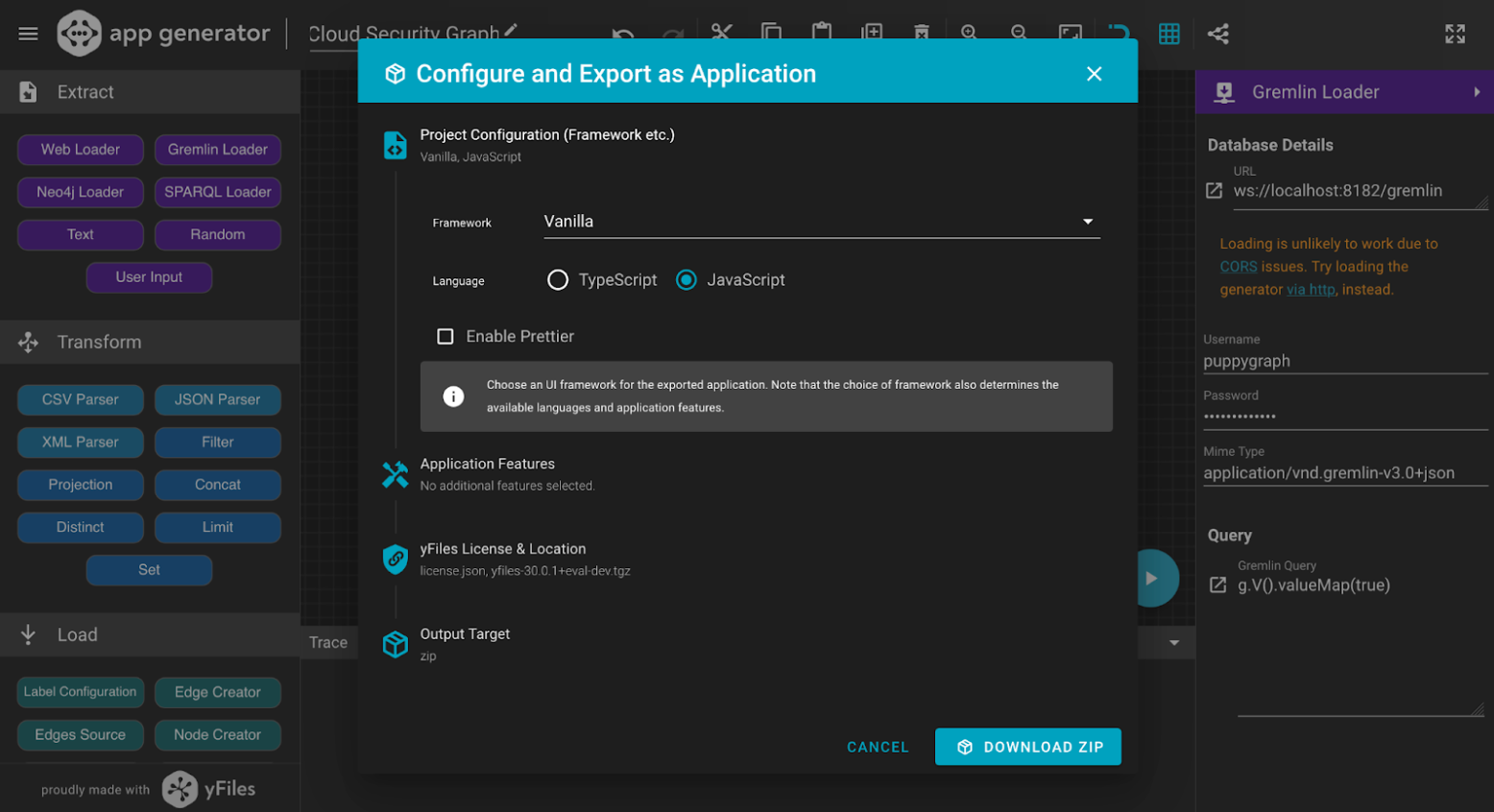
We can now unzip the folder and take a look. The code in src/lib/loadGraph.js should
correspond with what we've created in the app generator:
  export default async function loadGraph() {
  const data = await runQuery({
    query: 'g.V().valueMap(true)',
    password: 'puppygraph123',
    url: 'ws://localhost:8182/gremlin',
    username: 'puppygraph',
    mimeType: 'application/vnd.gremlin-v3.0+json',
  })
  const out = await project(data, { binding: (item) => item._items })
  const out2 = await filter(out, {
    expression: new Function(
      "with(arguments[0]) { return (label === 'InternetGateway') }"
    ),
  })
  const labelConfiguration = await buildLabelConfiguration({
    textBinding: (item) => item.id,
    placement: () => 'bottom',
  })
  const nodeCreator = await buildNodeCreator([labelConfiguration], {
    x: () => 0,
    width: () => 120,
    height: () => 80,
    styleProvider: 'ShapeNodeStyle',
    fill: () => 'lightpink',
    shape: () => 'round-rectangle',
    stroke: () => '2px #cc0055',
  })
  const labelConfiguration2 = await buildLabelConfiguration({
    textBinding: (item) => item.id,
    placement: () => 'bottom',
  })
  const nodeCreator2 = await buildNodeCreator([labelConfiguration2], {
    x: () => 0,
    width: () => 120,
    height: () => 80,
    styleProvider: 'ShapeNodeStyle',
    fill: () => 'lightblue',
    shape: () => 'round-rectangle',
    stroke: () => '2px #0055cc',
  })
  const nodesSource = await buildNodesSourceData(
    { data: out2, nodeCreator: nodeCreator2 },
    { idProvider: (item) => item.id }
  )
  const labelConfiguration3 = await buildLabelConfiguration({
    textBinding: (item) => item.label,
    placement: () => 'center',
    fill: () => 'gray',
  })
  const edgeCreator = await buildEdgeCreator([labelConfiguration3], {
    stroke: () => '1px gray',
    sourceArrow: () => 'none',
    targetArrow: () => 'triangle',
  })
  const data2 = await runQuery({
    query: 'g.E()',
    password: '',
    url: 'ws://localhost:8182/gremlin',
    username: '',
    mimeType: 'application/vnd.gremlin-v3.0+json',
  })
  const out3 = await project(data2, { binding: (item) => item._items })
  const out4 = await filter(out3, {
    expression: new Function(
      "with(arguments[0]) { return (label === 'ACCESS') }"
    ),
  })
  const edgesSource = await buildEdgesSourceData(
    { data: out4, edgeCreator },
    {
      sourceIdProvider: (item) => item.outV.id,
      targetIdProvider: (item) => item.inV.id,
    }
  )
  const data3 = await runQuery({
    query: 'g.V().valueMap(true)',
    password: '',
    url: 'ws://localhost:8182/gremlin',
    username: '',
    mimeType: 'application/vnd.gremlin-v3.0+json',
  })
  const out5 = await project(data3, { binding: (item) => item._items })
  const out6 = await filter(out5, {
    expression: new Function(
      "with(arguments[0]) { return (label === 'User') }"
    ),
  })
  const nodesSource2 = await buildNodesSourceData(
    { data: out6, nodeCreator },
    { idProvider: (item) => item.id }
  )
  const graph = await buildGraph({
    nodesSources: [nodesSource, nodesSource2],
    edgesSources: [edgesSource],
  })
  const out7 = await arrange(graph, {
    worker: false,
    name: 'HierarchicalLayout',
    properties: {
      layoutOrientation: 'top-to-bottom',
      edgeLabelPlacement: 'integrated',
      nodeDistance: 10,
      minimumLayerDistance: 20,
      automaticEdgeGrouping: false,
    },
  })

  return out7
}
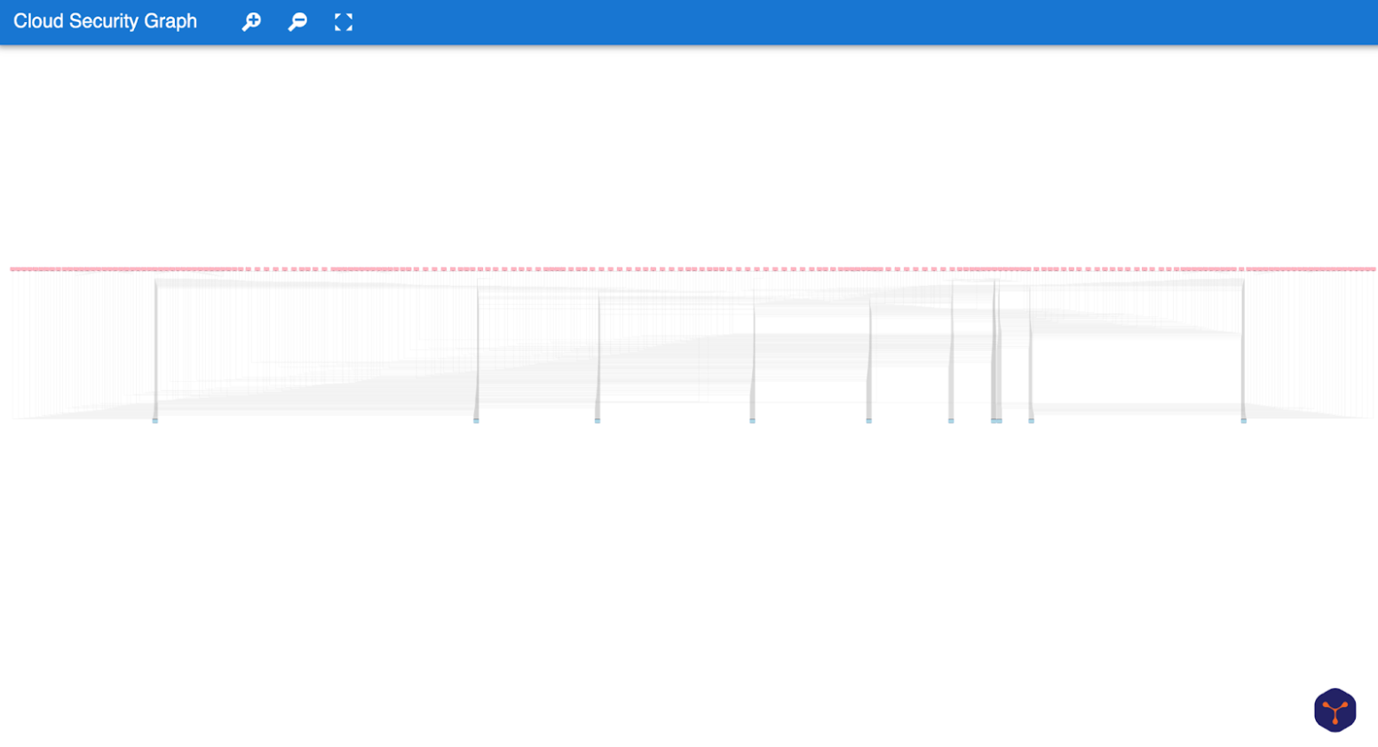
In the folder, run npm install and npm run dev, then head over to localhost:3000 to view the results:
7. Filter for admin access
Narrowing the search
The graph looks impressive from afar, but what exactly are we trying to achieve? Currently, we're querying for everything with this command:
g.V().valueMap(true)
That's not very informative. Instead, we'll frame our data to show which users have elevated privileges to these internet gateways, since they could serve as entry points for security attacks. We'll look for users with admin privileges to internet gateways.
Query 1: Getting the relevant internet gateways
  const data = await runQuery({
 query: 'g.V().outE("ACCESS").has("access_level", "admin").inV().dedup()',
 url: 'ws://localhost:8182/gremlin',
 username: 'puppygraph',
 password: 'puppygraph123',
 mimeType: 'application/vnd.gremlin-v3.0+json'
})
Query 2: Getting the edges
  const data2 = await runQuery({
 query: 'g.E()',
 password: '',
 url: 'ws://localhost:8182/gremlin',
 username: '',
 mimeType: 'application/vnd.gremlin-v3.0+json',
})
Query 3: Getting the users
  const data3 = await runQuery({
   query: 'g.V().hasLabel("User")',
   url: 'ws://localhost:8182/gremlin',
   username: 'puppygraph',
   password: 'puppygraph123',
   mimeType: 'application/vnd.gremlin-v3.0+json'
 })
If all works well, we should get the following webview:
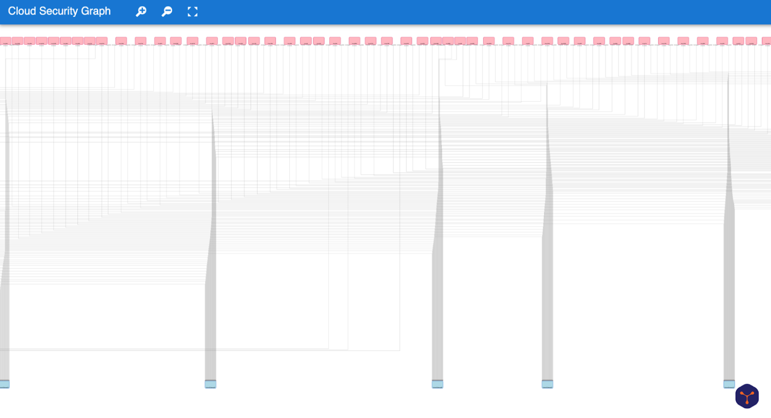
The hierarchical layout is a more specific form of tree layouts that focuses on the flow within a directed graph. Since there is a clear direction from users to internet gateways, the hierarchical layout makes it easy to see the number of incoming connections to each internet gateway, which could be helpful for spotting overloaded gateways or unusual traffic patterns. However, while we can quickly observe how many users are connected, it's harder to tell exactly which users are connected.
8. Optimize the layout
Let's change the arrangement of the graph in src/lib/loadGraph.js:
  const out7 = await arrange(graph, {
   worker: false,
   name: 'OrganicLayout',
   properties: {
     defaultPreferredEdgeLength: 40,
     defaultMinimumNodeDistance: 30,
     compactnessFactor: 0.5,
     gridColumns: undefined,
     gridRows: undefined,
   },
 })
This gets us a graph using the Organic Layout:
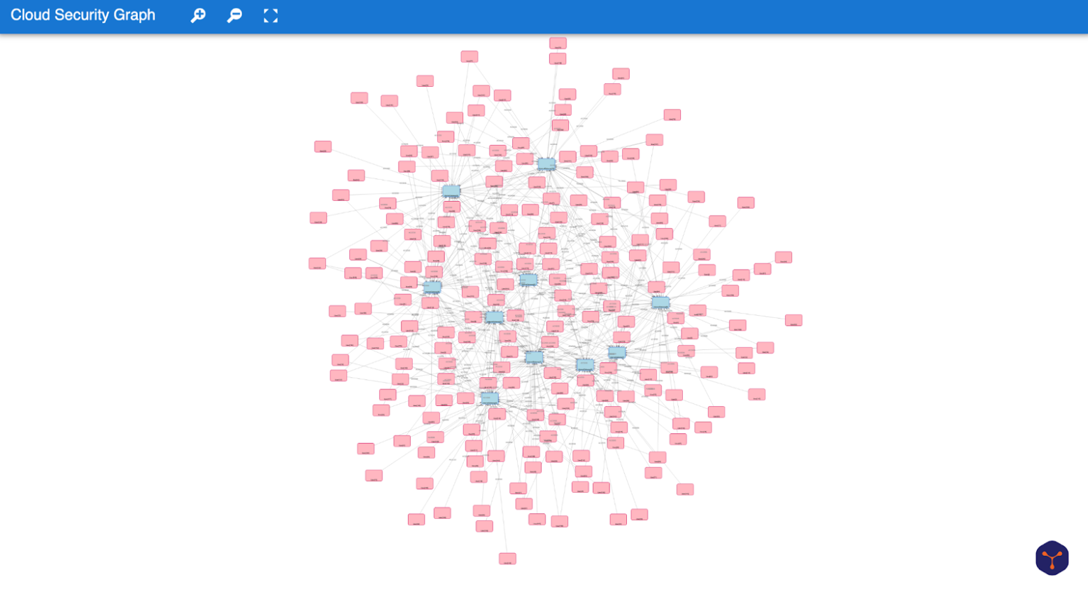
The Organic Layout is based on a force-directed approach, where connected nodes attract and unconnected nodes repel. This allows related nodes to naturally group together, making it easier to spot clusters within the data. We can see that our users form clusters around the internet gateways that they have access to, providing more focus on the users themselves. In this case, the organic layout seems to better fit with our use case of identifying users with elevated access privileges. Of course, discovering the perfect data visualization doesn't end here, but it is a good starting point.
Coding recap
In this example, we explored how to build real-time graph visualizations using PuppyGraph and yFiles. We started by selecting the best data visualization layout for our use case and configured our graph with PuppyGraph data. After previewing the application in the yWorks App Generator, we exported the generated code and examined the main source file to see how the data was loaded and visualized. This process provided a practical introduction to customizing layouts and working with real-time graph data in an interactive environment.
Frequently Asked Questions
How do I visualize the results of Gremlin or openCypher queries from PuppyGraph in a JavaScript app?
You can process the JSON graph data returned from PuppyGraph in your JavaScript application and map it to nodes and edges in a powerful diagramming library like yFiles for HTML. yFiles lets you render, style, and interact with your graph structure, supporting automatic layouts, custom visuals, and dynamic updates for your PuppyGraph data.
How do I display only users with admin access from PuppyGraph data in my graph visualization?
Use a suitable Gremlin or openCypher query to filter users with admin access in PuppyGraph, then take the filtered result and import it into your web application's graph model. Libraries like yFiles for HTML let you render just the nodes and edges from these results and further filter or highlight them interactively.
How do I integrate live data or real-time updates from PuppyGraph into my web application?
What should I do if my web-based graph visualization does not update correctly with PuppyGraph data?
First, check the network response and data mapping from PuppyGraph. When working with advanced libraries like yFiles for HTML, ensure each node and edge has a unique identifier and properties. Review your incremental update logic, confirm all services are running, and check the browser developer console for errors. For complex or large graphs, optimize both the PuppyGraph query and the client updates for performance.
Can I prototype applications with PuppyGraph and yFiles before purchasing a license?
Yes, you can! PuppyGraph provides a free Developer Edition for prototyping and local development (see pricing), and yFiles for HTML offers a free evaluation version (download trial). This means you can test, build, and validate your prototype before you decide to purchase a commercial license for either toolkit.
How do I get started quickly building a graph visualization application with PuppyGraph and yFiles?
You can deploy PuppyGraph in minutes using Docker or the cloud (see PuppyGraph docs). Run openCypher or Gremlin queries to extract your graph. Then use yFiles for HTML in JavaScript or try the no-code App Generator (yWorks App Generator). Both tools provide detailed docs and examples & yFiles documentation to help you go from raw data to custom visualization quickly.